
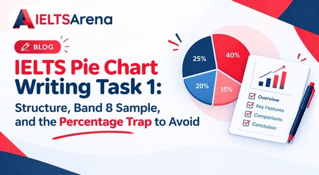
You open the Task 1 question and see a pie chart. It has six slices, each with a percentage. You start describing them left to right, then top to bottom, then you notice you have written 210 words that list every figure and say nothing about the overall shape of the data. The examiner reads your response and marks Task Achievement at Band 5, regardless of your grammar and vocabulary elsewhere. This is the pie chart trap, and it catches candidates who prepared with bar charts and line graphs and assumed a pie chart would be easier.
Quick answer: IELTS pie chart writing task 1 asks you to describe proportions across categories in 150 words minimum within 20 minutes. Use a four-paragraph structure: a one-sentence introduction paraphrasing the question, a two-sentence overview stating the biggest and smallest categories with no exact figures, one body paragraph covering the largest three or four segments with specific percentages, and one body paragraph covering the remaining segments and any notable comparisons. The single most common mistake is listing every percentage without grouping, which caps Task Achievement at Band 5 even when the English is otherwise strong.
What a Pie Chart Actually Tests
A pie chart in IELTS Academic Writing Task 1 asks you to describe the proportional breakdown of a whole across several categories, expressed as percentages that add up to 100. A single pie chart might show household spending categories in one country in one year. A more common variation shows two or three pie charts covering different years, different countries, or different demographic groups, and asks you to compare them.
The skill this question tests is fundamentally different from a bar chart or line graph. A line graph tests your ability to describe trends over time. A bar chart tests your ability to compare quantities across categories. A pie chart tests your ability to describe proportions of a whole and, when multiple pie charts appear, to compare how those proportions shift between one whole and another.
Task Achievement, one of the four Task 1 assessment criteria weighted at 25 percent each, checks whether you correctly identified the visual type, gave an overview of the main features, and reported the data accurately. Coherence and Cohesion checks whether you grouped the categories logically instead of listing them in the order they appear on the chart. This grouping decision is what separates a Band 5 response from a Band 7 response on pie chart questions.
Advertisement
How Pie Charts Compare to Every Other Task 1 Chart Type
Confusing a pie chart's skill requirements with a different Task 1 type is the fastest way to lose marks on Task Achievement. Here is how the six main Academic Task 1 chart types differ:
| Chart Type | What It Shows | Main Skill Tested | Common Trap |
|---|---|---|---|
| Line graph | Trends over time | Describing changes and turning points | Listing every point on the line |
| Bar chart | Quantities across categories | Comparing values and identifying the largest and smallest | Describing bars left to right |
| Pie chart | Proportions of a whole | Grouping segments and comparing shares | Listing every percentage without grouping |
| Table | Multiple variables in rows and columns | Identifying key comparisons across two dimensions | Reading row by row |
| Process diagram | Sequential stages | Using correct passive voice and sequence markers | Treating it like a chart with trends |
| Map | Spatial changes | Describing location and direction of changes | Using inconsistent orientation language |
Notice the shared pattern: every Task 1 type rewards selection and grouping, and punishes exhaustive listing. What is specific to the pie chart is that the raw data is already expressed as percentages, which tempts candidates to simply repeat every figure instead of stepping back and describing the shape of the distribution.
If you have already reviewed the bar chart guide, the line graph guide, and the process diagram and map guide, the pie chart is often the question type candidates prepare least for despite it appearing in roughly one in five Task 1 exams globally.
Why Common Approaches Fail
Three specific mistakes account for most low Task Achievement scores on pie chart questions. Each one carries a predictable mark loss.
Mistake 1: Listing every percentage without grouping. Candidates describe the chart segment by segment, mentioning each percentage in the order the slices appear. The response reads as a data dump instead of a structured description. Task Achievement is capped at Band 5 and Coherence and Cohesion typically follows at Band 5 or 6, because the response has no logical progression that the examiner can follow. This mistake alone accounts for the largest share of sub-Band 6 pie chart responses.
Mistake 2: Writing no overview. Candidates dive straight from the introduction into the first data paragraph without stating what the chart shows as a whole. The overview is the single most important paragraph in Task 1, and its absence is one of the fastest routes to Band 5. The examiner is specifically trained to check whether you identified the biggest and smallest categories and any obvious pattern before you started reporting figures.
Mistake 3: Comparing two pie charts as if they were unrelated. When the question shows two pie charts, candidates often describe the first fully, then the second fully, with no comparison sentences between them. This treats the question as two separate mini-tasks and misses the entire point of the two-pie-chart format. Task Achievement drops by half a band to a full band because comparison is exactly what the question is asking for.
A Real Student's Story: Band 5.5 to Band 7.0 in Six Weeks
Isabel, a nursing graduate from Manila applying to a university in Toronto, kept scoring Band 5.5 in Writing despite hitting Band 7.0 in every other section. She reviewed her last four Task 1 attempts and noticed a pattern: every time a pie chart appeared, her response ran 190 to 210 words, listed every percentage in order, and had no overview paragraph. Every time a bar chart or line graph appeared, her structure was fine.
I thought pie charts were the easy one because the data is already given as percentages. I didn't realise that was exactly why examiners want you to group and compare, not just repeat the numbers on the page.
She restructured her approach around three rules: identify the two largest and one smallest segment before writing anything, group the remaining segments by size band, and write one overview sentence stating the dominant category before any body paragraph. On her next pie chart attempt, Task Achievement moved from Band 5 to Band 7 with almost no change to her vocabulary or grammar. Her overall Writing band lifted from Band 5.5 to Band 7.0 in six weeks, driven entirely by fixing this one question type.
The Data Behind This Question Type
Cambridge Assessment English reports that Task Achievement is the criterion where candidates lose the most marks in the Band 5 to Band 6.5 range on Academic Writing Task 1, and pie chart questions produce a disproportionate share of those losses because the data format tempts exhaustive reporting (Cambridge Assessment English, IELTS Test Statistics 2024 to 2025).
British Council examiner reports specifically flag the absence of an overview paragraph as one of the most common single-mistake causes of a capped Task 1 band. IELTS.org confirms the four Task 1 assessment criteria for 2026 remain Task Achievement, Coherence and Cohesion, Lexical Resource, and Grammatical Range and Accuracy, each weighted equally, with the same overview requirement applied across every Task 1 chart type (IELTS.org, 2026 assessment framework).
Internal tracking on IELTSArena shows that roughly six in ten pie chart submissions in the Band 5 to Band 6 range list every segment percentage in sequence without any grouping. The same tracking shows that candidates who explicitly write the overview paragraph before any body paragraph score half a band to a full band higher on Task Achievement, on average, than candidates who write the overview at the end or skip it entirely.
The Right Approach: A Four-Paragraph Structure
Use this structure every time you see a pie chart or a set of pie charts in Task 1.
Paragraph 1: Introduction (1 to 2 sentences, 25 to 35 words). Paraphrase the question in your own words. State what the pie chart or charts show, the categories being compared, the location and time period if given, and the unit (percentages or proportions).
Paragraph 2: Overview (2 to 3 sentences, 35 to 50 words). State the largest and smallest categories. If there are two or more pie charts, state the biggest change or the biggest similarity between them. No specific percentages in this paragraph. The overview is the summary a busy reader could take away without reading the rest of the response.
Paragraph 3: Body paragraph one (50 to 70 words). Describe the largest three or four segments with specific percentages. Group them logically, either by size or by category type. Use comparison language rather than just listing figures.
Paragraph 4: Body paragraph two (50 to 70 words). Describe the remaining smaller segments and any notable comparisons. For two-pie-chart questions, this paragraph is where you draw the sharpest contrast between the two wholes.
Total target for an IELTS pie chart writing task 1 response: 160 to 190 words in 20 minutes. Writing at the minimum 150 leaves no margin for error. Writing much beyond 200 usually means you are listing rather than describing.
A simple 2-minute planning routine prevents most Task Achievement losses on pie charts: circle the largest segment, circle the smallest, and note any grouping you can make (for example, three segments over 20 percent forming the majority, three segments under 10 percent forming a long tail). Do this before you write a single word.
Sample Prompt with Band 8 Model Answer: Single Pie Chart
Prompt: "The pie chart below shows the main reasons given by adults in the UK for buying products online in 2024. Summarise the information by selecting and reporting the main features, and make comparisons where relevant."
Segments: Convenience 38%, Lower prices 27%, Wider choice 18%, Home delivery 9%, Product reviews 5%, Other 3%.
Model response (176 words):
The pie chart illustrates the primary reasons UK adults gave for choosing to shop online in 2024, expressed as percentages of total respondents.
Overall, convenience was by far the most cited reason, while product reviews and other miscellaneous factors accounted for only a small share. Lower prices and wider choice together made up a substantial second tier of responses.
Convenience dominated the responses at 38 percent, more than one in three adults, making it the single most important driver of online shopping in the survey. Lower prices followed at 27 percent, and wider product choice at 18 percent. Together, these three practical reasons accounted for 83 percent of all responses.
The remaining categories were considerably less significant. Home delivery, despite being a defining feature of online shopping, was cited by only 9 percent of respondents. Product reviews, at 5 percent, and other unspecified reasons, at 3 percent, made up the smallest shares. The pattern suggests that UK adults value the process of shopping online more than any single service feature.
This response opens with a paraphrased introduction, gives a full overview without exact figures, groups the top three reasons into a "practical drivers" cluster with an accurate sum, and closes with a controlled interpretation of the pattern. Task Achievement, Coherence and Cohesion, Lexical Resource, and Grammatical Range and Accuracy would all sit at Band 8 for this length and quality.
Sample Prompt with Band 8 Model Answer: Two Pie Charts
Prompt: "The two pie charts below show the proportion of household expenditure on different categories in Australia in 1990 and in 2020. Summarise the information by selecting and reporting the main features, and make comparisons where relevant."
1990 segments: Housing 22%, Food 25%, Transport 15%, Utilities 10%, Healthcare 8%, Entertainment 6%, Other 14%. 2020 segments: Housing 34%, Food 17%, Transport 14%, Utilities 12%, Healthcare 11%, Entertainment 5%, Other 7%.
Model response (183 words):
The two pie charts compare how Australian households divided their spending across seven categories in 1990 and 2020.
Overall, housing rose sharply to become the dominant category by 2020, while food, which led in 1990, fell to third place. Healthcare and utilities both increased modestly, and the miscellaneous "other" category shrank by half.
Housing spending climbed from 22 percent in 1990 to 34 percent in 2020, replacing food as the single largest expenditure and reflecting the well-documented rise in Australian property costs. Food, in contrast, fell from 25 percent to 17 percent, an eight percentage-point drop that made it only the third-largest category by 2020.
Among the remaining categories, healthcare grew from 8 percent to 11 percent, and utilities from 10 percent to 12 percent, both reflecting a modest but consistent shift toward essential services. Transport was almost unchanged at 15 percent and 14 percent. Entertainment declined slightly from 6 percent to 5 percent, while the "other" category halved from 14 percent to 7 percent, suggesting more precisely categorised spending patterns in the later survey.
This response draws the comparison from the first sentence of the overview, groups the changes by direction (rising, falling, stable), and provides accurate percentage-point comparisons rather than raw percentages alone, which is what pushes Lexical Resource and Task Achievement into Band 8 territory.
Vocabulary for Describing Proportions
Task 1 pie chart responses reward precise proportional language over vague quantifiers. These are the phrases that consistently appear in Band 8 and Band 9 responses:
For large shares: "accounted for", "made up", "represented", "dominated", "the largest share went to", "roughly one in three", "just under half", "the majority of".
For comparisons between segments: "twice as much as", "three times the share of", "significantly more than", "marginally higher than", "roughly the same as", "comparable to".
For change between two pie charts: "rose by X percentage points", "fell from X percent to Y percent", "remained stable at around X percent", "the share of X increased sharply", "X declined marginally".
Avoid: "a lot of", "very much", "many people", "some", "few". These vague quantifiers are Band 5 vocabulary and pull your Lexical Resource down even when the surrounding grammar is strong.
How IELTSArena Helps You Practise This Specifically
IELTSArena's Task 1 question library includes a dedicated pie chart practice set alongside separate sets for bar charts, line graphs, tables, process diagrams, and maps, so you can drill this specific format rather than hoping a pie chart does not appear on test day. Every submission is scored against Task Achievement, Coherence and Cohesion, Lexical Resource, and Grammatical Range and Accuracy separately, so if your response is losing marks on Task Achievement specifically because of missing grouping or no overview, the feedback names it directly rather than leaving you to guess.
Expert tutors on IELTSArena review pie chart responses with a specific focus on the two most common gaps: the missing overview paragraph and the absence of grouping. The platform also replicates the real IELTS CBT interface, including the 20-minute timer for Task 1 and the on-screen word counter, so your practice sessions match the exact conditions you will face on exam day. Over 10,000 students have used IELTSArena to reach their target band, with Writing consistently being the section where students see the fastest improvement once per-criterion feedback is available.
Start your free IELTS practice on IELTSArena and try a timed pie chart response this week.
Self-Diagnosis: Are You Ready for an IELTS Pie Chart Prompt?
Work through these questions honestly before your next practice session.
Can you identify the largest and smallest segments within 30 seconds of seeing a new pie chart, before you start writing? Do you write an overview paragraph as your second paragraph, or does it end up in your conclusion or nowhere at all? Can you group the segments of a six-slice pie chart into two or three logical clusters, or do you describe them one by one? For a two-pie-chart question, do you draw the comparison in the first sentence of the overview, or do you describe each chart separately? Are you using precise proportional language like "accounted for" and "one in three", or vague language like "a lot" and "many"? Have you timed yourself writing a full pie chart response in 20 minutes, start to finish, in the last two weeks?
If you hesitated on more than two of these, the pie chart is likely your weakest Task 1 format right now, and it can be fixed in fewer practice sessions than any other chart type because the fix is structural, not linguistic.
Key Takeaways
- IELTS pie chart writing task 1 tests proportional description, not exhaustive listing. Group and compare, do not list every percentage the chart shows.
- Use the four-paragraph structure: 1-sentence introduction, 2-to-3-sentence overview, two body paragraphs each 50 to 70 words. Total target 160 to 190 words.
- The overview paragraph is non-negotiable. Its absence alone caps Task Achievement at Band 5.
- For two-pie-chart questions, draw the comparison in the overview and continue it through the body paragraphs.
- Use precise proportional language: "accounted for", "one in three", "rose by X percentage points". Avoid vague quantifiers.
- Plan for 2 minutes: identify largest, smallest, and grouping before writing.
Related Guides on IELTSArena
- IELTS Bar Chart Writing Task 1: Band 8 Guide
- IELTS Line Graph Writing Task 1: Band 8 Guide
- IELTS Process Diagram and Map Writing Task 1
- IELTS Writing Task 1 General Training: Letter Guide
- IELTS Writing Band Score Explained
- How to Improve Your IELTS Writing Score from Band 5 to Band 7
See Where Your Task 1 Band Stands Today
Try a free mock test at ieltsarena.com and see your band score in minutes. In one free timed pie chart response, you will know exactly where your Task Achievement score stands today, and whether grouping and overview are the gaps holding your Task 1 band back.
Start your free IELTS practice on IELTSArena
Frequently Asked Questions
How do I describe a pie chart in IELTS writing task 1? Use a four-paragraph structure. Start with a one-sentence introduction that paraphrases the question and states what the pie chart shows. Follow with a two-to-three-sentence overview naming the largest and smallest segments without exact figures. Then write one body paragraph covering the largest three or four segments with specific percentages, grouped logically. Close with a second body paragraph covering the remaining segments and any notable comparisons. Aim for 160 to 190 words in 20 minutes. Never list every percentage in the order the slices appear, because this caps Task Achievement at Band 5 regardless of your grammar and vocabulary elsewhere in the response.
What is the best structure for an IELTS pie chart response? The best structure is four paragraphs: introduction, overview, body paragraph one, body paragraph two. The introduction paraphrases the question in one to two sentences. The overview states the biggest and smallest categories and any pattern between multiple pie charts if present, without any specific percentages. The two body paragraphs report the actual data, with segments grouped by size or category type rather than listed in slice order. This structure matches what examiners are trained to look for on Task Achievement and Coherence and Cohesion, and it is the same structure used for high-scoring bar chart and line graph responses.
How many percentages should I mention in an IELTS pie chart response? Mention every percentage the chart shows if there are six or fewer segments, but group them logically rather than listing them in slice order. If the chart has seven or more segments, focus on the top three to four with exact percentages and describe the remaining smaller segments as a group. For a two-pie-chart question, mention every percentage in both charts only if the total segment count is manageable, otherwise select the categories that show the biggest changes and describe the rest in summary. The rule is: report accurately, but always group and compare rather than list.
Why did I lose marks on my IELTS pie chart task 1 even though my English was strong? The most common reason is Task Achievement, not language quality. If you listed every percentage in slice order without grouping, or if you skipped the overview paragraph, or if you treated a two-pie-chart question as two unrelated descriptions, Task Achievement gets capped at Band 5 or 6 regardless of your Lexical Resource and Grammatical Range scores. Task Achievement is 25 percent of your Task 1 band, so a cap here pulls your overall Task 1 score down by half a band to a full band. Fixing this is structural, not linguistic, and typically produces a visible band-score gain within two or three practice sessions.
Is describing a pie chart easier than a bar chart in IELTS? Pie charts look easier because the data is already given as percentages, but they are often scored lower than bar charts because the given-percentages format tempts candidates to simply list every figure instead of grouping and comparing. Bar charts force you to compare heights, which prompts natural comparison language. Pie charts require the candidate to actively decide to group and compare instead of listing, which is a discipline problem rather than a language problem. If you find pie charts easier than bar charts, check your last three pie chart responses for the overview paragraph and for any grouping. Their absence is why the format punishes candidates who assumed it was the simplest.
Last updated September 2026 by the IELTSArena Editorial Team, a team of IELTS tutors, certified CBT examiners, and Writing feedback specialists who publish weekly research-backed guides on ieltsarena.com.